Actionscripting..
Its been years since I did actual game-like programming, but thanks to Rafael at work who told me about Flixel and using Actionscript to get started. I never knew it was this easy, I thought you needed to know flash and all that, but it really is a lot like the 2D C++ “GameEngine” I learnt to program with in university. Only much easier, faster and less limiting. I’m not saying C++ is slow and limited, but for someone who codes for fun, I couldn’t care less if c++ allows more control and all that.
So here’s what i came up with so far:
http://www.laurenscorijn.com/Sirius.swf
It’s the start of a spaceship game that should have everything random generated (well except for the names). I based the spaceship generation code on Dave Bollinger’s PixelSpacehips. (site’s dead, hence wayback). Keep refreshing, it’s different every time! It also cycles between 5 types of country naming types, US, Japanese, Russian, German and French (it’s so fun coming up with the names).
Plus, I just found out you can do shaders in Actionscript, so now I can manipulate graphics faster and even easier!
Manitoba
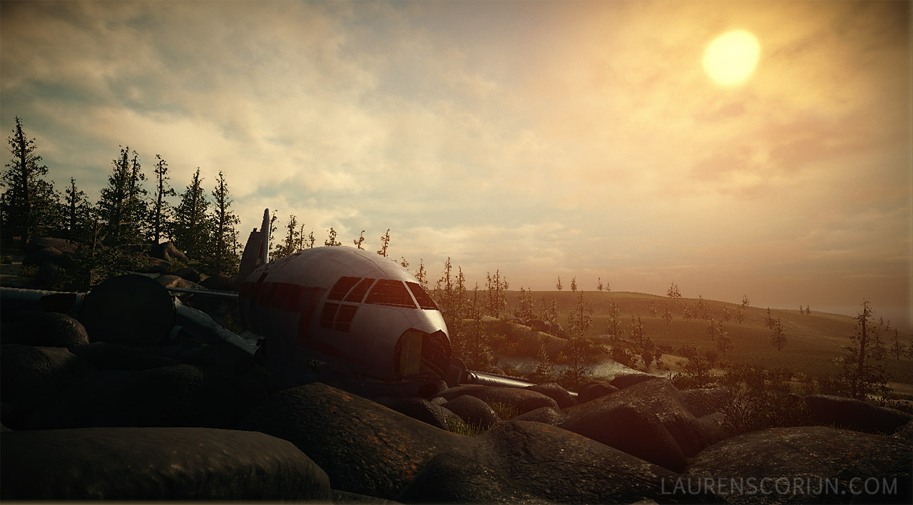
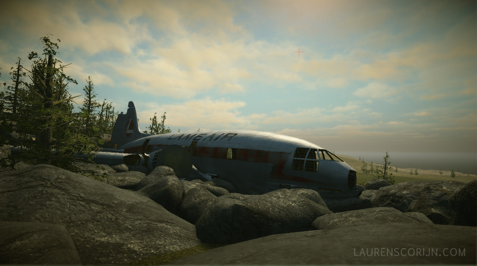
Manitoba Crash Site
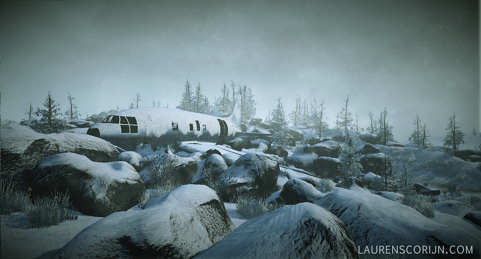
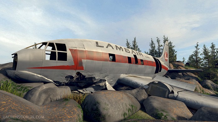
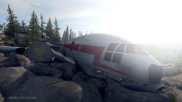
This is a personal project where I’m recreating the 1979 crash site of Curtiss C-46 Commando C-GYHT, near Churchill, Manitoba, Canada. It’s still a work in progress but there’s enough to show already. Using the Unreal Development Kit.
I’ve done a whole bunch of fun things here like dynamic-day night cycles, dynamic snow blending, complex-multi UV material setups for the plane wreck (the most technically complex asset I’ve ever created), etc..
Texturing Rearlights
Texturing car rearlights from scratch
Intro
Porsche 959 rearlight texture created from scratch.
This article talks about painting rearlight textures for cars from scratch, as this is something I really struggled with a few years ago, until I taught myself how to properly do this.
First off, I have to mention:
It’s easier and faster to grab the texture from a photograph, than to paint from scratch.
If you can find a photograph that will work as a texture, do use it. The method described here is not exactly quick and easy to get realistic and it takes a lot of work to get decent results. However, there are plenty of cases where a photo is not an option. You just might not be able to find a decent photo online, and have no access to the real car to take a picture yourself. Or the car you’re creating might not even be a real car and require a custom solution. Or you could choose to paint it as a style choice, since the handpainted lights do look better if enough effort is put into them.
Reference
Like anything you create in 3D, you will need reference for the texture you’re creating. Especially since this is a technical component with a specific, hard-to-nail look. I always have a few pictures open right next to me, as I constantly need to look at these to keep in mind the effects that I want to achieve.
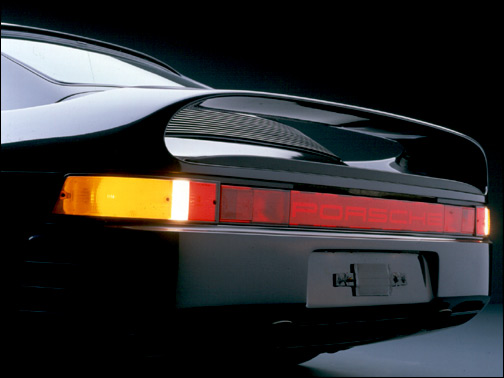 This picture was an excellent reference when creating the 959 lights. Reason for this is crisp image quality, but mostly, perfect lighting conditions. The reflections and refractions we paint all depend on the environment lighting and in this picture it’s a very generic, simplified studio light setup. The only downside of this pic is how the indicators and reverselights are lit, obscuring a lot of detail by overbrighting.
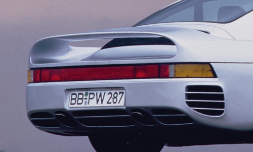 While not as good as the other picture, this one does show the obscured indicators and fills the gap in information.
I used a few more pics than this, as always with reference; you can never have enough.
Real life breakdown
To be able to decently paint this kind of texture, you need to understand how these lights are built in real life. If you’ve ever taken one apart, you should know it’s quite simple.
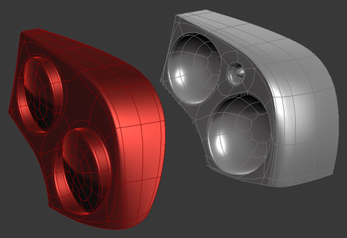 This is a quick grab from a 3D project, as I could not find one of the real 959 rearlight. It shows how you have at the very least the colored lens for the light, which gives the whole thing its specific color and refracts light. Then there’s the frame, onto which the lens is mounted. The frame holds all the electrical components. It can be built up out of multiple parts, but for painting you can generalize it to one or two. The inverted dome shapes reflect the light from the bulb in a more concentrated way and are a very typical part of these lights. Some frames might have rubber or black plastic padding parts, which are not very hard to recreate. On the previous refpics you can see there’s a small black frame around the lenses.
This whole two parts setup affects how you build your texture, as there are two “layers” in real life (not necessarily PSD layers).
- The top layer, the colored lens, reflects slightly but mostly refracts
- The bottom layer, the chrome or metal frame, only reflects
These two wave phenomenon, change the way light affects the surfaces.
Refraction is when light passes through a transparent objects (such as the lens) and is bent by the material it passes through. It can also change the color of light passing through, by affecting different frequencies, in our case filtering light so it turns red most of the time.
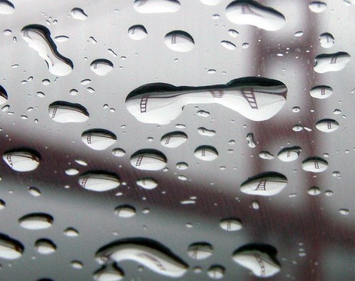 An example of refraction, showing how it’s affected by surface normal and thickness among others.
Reflection should be more known, this is when light is bounced back off a surface.
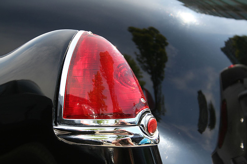 Example of reflection on a car rear light.
The important thing to keep in mind with these two phenomenon, is that they are view-dependent.
This means that the effect changes as the viewer changes position/angle. It will never look the same from two different angles. This clashes with a texture, as a texture is static and always looks the same on an object no matter at what angle, it is view-independent. Calculating these effects in realtime is just too slow, so we need to try and get as much of these effects into a texture without it looking fake, which is where the whole challenge lies. This is the main reason why you want reference pictures with generic light and reflection conditions.
The Photoshop Process
Once you understand the ideas behind the real life objectsm you can start creating the textures.
Important is that there are two ways to do this: there’s the older, pure diffuse method, where the glass and chrome layer are condensed to a single texture. You can also do the more “next-gen” approach, where there’s a base mesh for the frame, which uses a normalmap to get a lot of detail in there, as well as a transparent mesh for the lens. You need to create two textures and meshes for this, but it does allow for a more realistic result in some cases.
In this section I’ll take you through the simpler, diffuse-only way that was used for the 959 lights. Even in current high-end games, this technique can still look good.
Base colors
I start off by laying down the base colors for all the separate pieces of the light. Making sure that each segment has a separate layer, to ease working with it. I’m also only creating half of them, since the others are just gonna be duplicates once finished.
![]() Once that is done, I’m going to do the black plastic frame around the lights. I create a selection out of the base colors, and subtract that from a new layer filled with dark grey/almost black. Then I add a bevel and emboss with lighting from the top (light set to 90 degree angle).
Once that is done, I’m going to do the black plastic frame around the lights. I create a selection out of the base colors, and subtract that from a new layer filled with dark grey/almost black. Then I add a bevel and emboss with lighting from the top (light set to 90 degree angle).
![]() The settings were obviously tweaked, since default Bevel and emboss looks terrible. Subtelty is key.
The settings were obviously tweaked, since default Bevel and emboss looks terrible. Subtelty is key.
Detailing the parts
Once this is done, I’ll go over every component and finish them.
First up is the center piece.This piece is simpler since there is not much of a complex reflecting frame behind it, it’s rather flat. I start by adding a darker stroke around the edges, to simulate slight refraction. Then I add another bevel and emboss, picking bright red for the highlight color, and settings things subtle again. I also add a very slight white to black gradient, set to Overlay blend.
![]() When using these layer styles at this texture resolution, it really is important to keep it all crisp and sharp. Don’t use values bigger than 1 or 2px in size when doing Strokes and B&E.
When using these layer styles at this texture resolution, it really is important to keep it all crisp and sharp. Don’t use values bigger than 1 or 2px in size when doing Strokes and B&E.
I add the text (with a custom Porsche font), and use small, pixel precise selections (on a new layer, which is then merged down onto the base) to get the lighter and darker areas on the bottom and top, as seen on the ref.
Reflections
The next part would be one of the red squares next to it. These rely less on layer effects and require you to manually paint some reflections. I do duplicate the layer style from the previous one, remove the gradient overlay and tweak the settings a bit. Then I use a soft paint brush (low flow) with lighter and darker tones to paint the effect of a concave dome reflecting a simple environment.
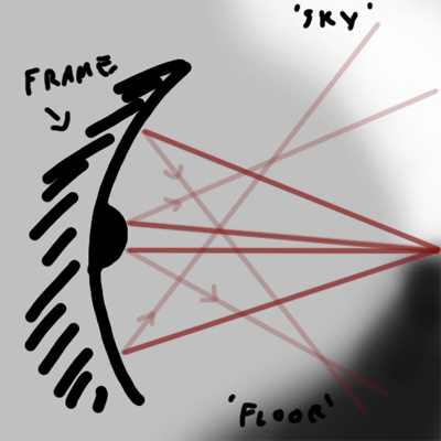
![]() To imagine how you paint these exact tones, think of the following image, which represents a cross-section profile of the frame.
To imagine how you paint these exact tones, think of the following image, which represents a cross-section profile of the frame.
The red lines are vectors that originate from your eye and are bounced back by the metal to sample the environment, which is represented by the simplified “sky” and “ground”. The color traced from the environment by the reflected ray, is shown on the metal frame. If you think about it, the eye position can change in real life, so we are painting an approximation here. The reflecting environment is also a simplification of the real world, but by doing this we make sure the texture works in any environment, unlike a photograph of a specific situation.
Looking at the texture, we see that there is too much contrast in the reflections. It looks like we’re looking straight at the metal, unfiltered by the red lens in front. To fix this, I duplicate the layer, revert back to the solid colors I had before I painted in the reflections, and then just change the opacity of the layer just like the opacity of the real lens.
![]() It’s only a slight difference, but this is the main method I use for separating the frame and lens layers. Right now the opacity of the top “lens” layer is about 40%. You might wonder why I didn’t use a regular contrast adjustment, but this tends to destroy color saturation compared to the new layer method.
It’s only a slight difference, but this is the main method I use for separating the frame and lens layers. Right now the opacity of the top “lens” layer is about 40%. You might wonder why I didn’t use a regular contrast adjustment, but this tends to destroy color saturation compared to the new layer method.
Refractions
The next piece of the light does not have a concave reflecting frame, but the lens presents a new challenge. The inside has a 3D pattern to it, meant to refract light in a more spread pattern. The picture below shows what I’m talking about.
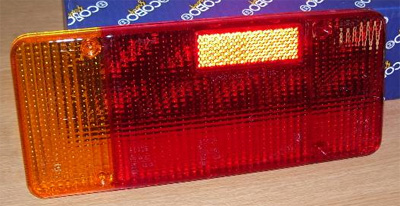 Most of the time this pattern looks like a grid of rounded cones or pyramid shapes. Some newer cars might have special patterns that look different. Rays passing through this lens are bent in a different direction, as illustrated below.
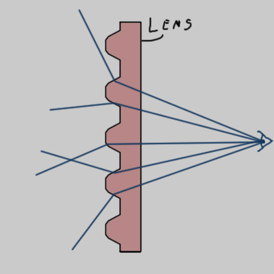 The pixels shown through this lens would be offset in different directions, resulting in the typical refract look. This exact technique is applied in for example the Unreal engine in realtime, using normalmaps as the refraction direction.
Unfortunately in Photoshop, there is no easy way to do this same thing, even though the math behind it is not difficult at all. Instead, I simply use pattern overlays set to blend modes such as Overlay.
So first off I add the base colors and layer style.
To get the refract effect I’ve added a pattern fill layer, using a techy pattern pack I downloaded online. A few of these can go a long way for textures (it’s also easy to create new ones yourself). I adjust the scale so it matches (though 100% tends to work best), set the blend mode and adjust opacity. I’ve blown up the affected part since the pattern is not very visible otherwise.
 After this part, I used the same techniques to create the small red and light pieces of the light. For the white part I painted some faint, darker strokes with varying sizes of small brushes to get some contrast in there.
Finishing up
The yellow indicator light area is the most complex of all of the pieces, but there are no new techniques required for it. Since it’s pretty large, a lot is going on behind it, while it’s also quite blurry due to the lens refractions.
![]() This step is the result of quite a few layers and actions, with a whole lot of tweaking to it. More layers definitely help when doing a complex part.
This step is the result of quite a few layers and actions, with a whole lot of tweaking to it. More layers definitely help when doing a complex part.
After all this is done, I’ll duplicate the lights to the other side. You could argue that this is possible in UV’s also, but I kept these two sides unique since I planned on adding unique damage to both sides (it was meant for a game that used damage textures). Once this is duplicated, I add layer with a slight white gradient on top of everything, making sure that the black border is masked out.
![]() This gradient is not required, but it helps sell the material as glass more. You could omit this if the shader used in-game can fake the reflections adequately.
This gradient is not required, but it helps sell the material as glass more. You could omit this if the shader used in-game can fake the reflections adequately.
Head lights
This article talks mostly about rearlights, though I would like to mention head lights. Usually these have completely clear lenses, so it’s better to model the actual geometry behind it and use a clear lens. It really depends on the type of headlight, but mostly 3D geometry will look better. There are some cases where you would be able to use the same techniques as here, but to my experience you really want to watch out that the headlights don’t look to flat, as they are a big focus point on the car.
Here’s a few examples of 3D geometry head lights:
These lights had clear lenses, but the geometry behind them used normalmaps for extra detail.
The HotRod’s headlights had normalmaps for the lenses as well, to really sell the old-school style.
GZ81
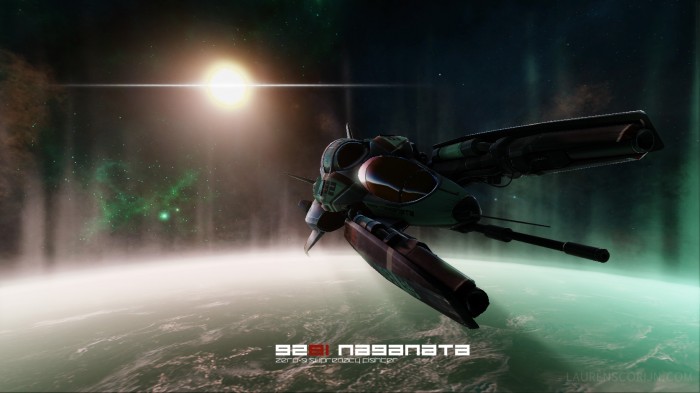
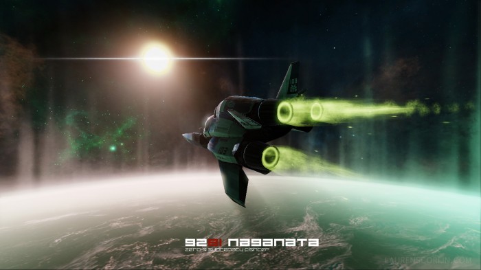
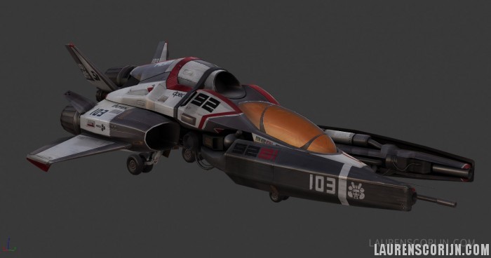
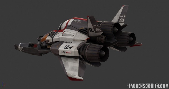
GZ81 Naganata
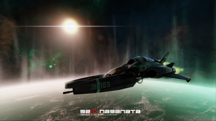
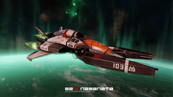
GZ81 Naganata – Zero-G Supremacy Fighter
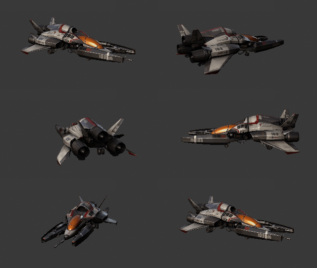
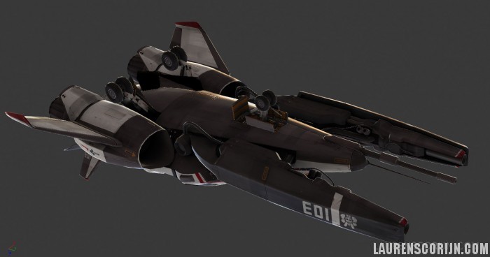
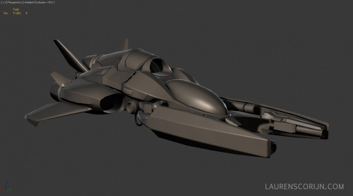
Portfolio piece, based on DasNewten’s concept, modified by me. The Samurai logo is by Leri Greer.
- 28.000 tri’s
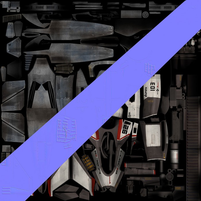
- 1 textureset (diffuse, normal, specular)
- 2048px in size
- realtime screengrabs only
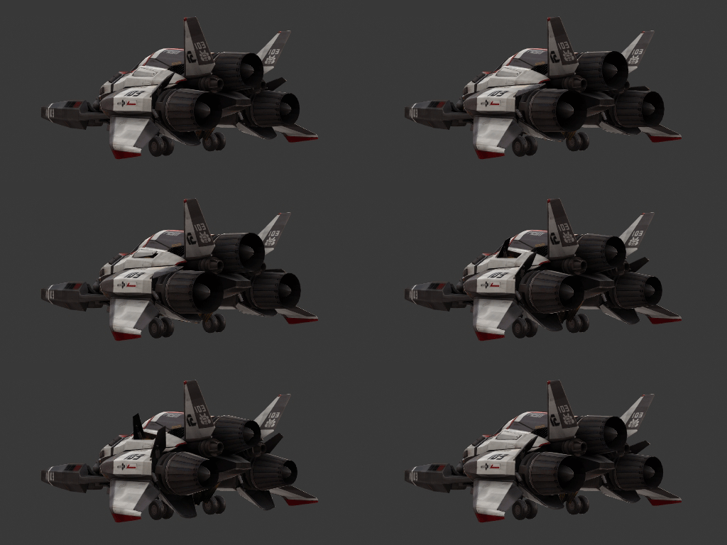
The space scene images are from UDK, a scene built completely by myself. Particle effects are also mine. The gray background images are from 3DS Max with my own shader. The ship is fully rigged and animated, gears, flaps and thrusters all function.
Final Images
Spaceship Model
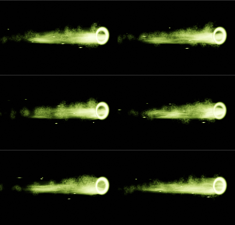
Particles
Do not that the motion looks choppy in the GIF file.
Space Env UDK setup
A little bit of explanation on how the UDK scene was set up. I tried to analyze Halo reach’s space level as closely as I can and replicate it in my own way.
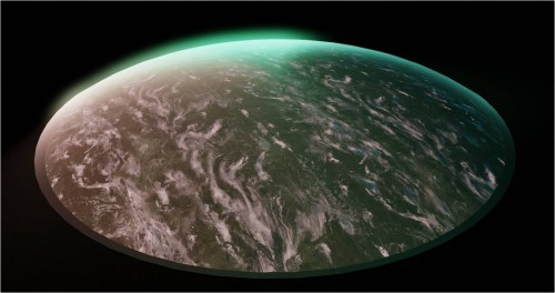
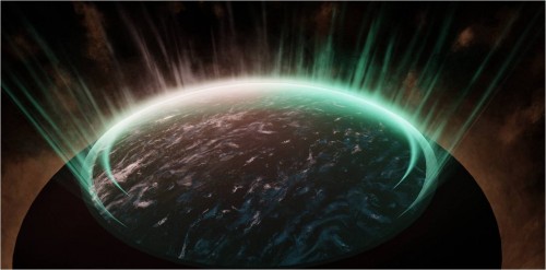
Planet Base
The base of the planet is a simple mesh with a multi-layer surface shader simulating terrain, water and a separate layer of scrolling clouds.
On top of that is a second mesh to simulate the atmosphere scattering, blending in color depending on the light angle XY component (facing light = red, not facing = green).
Textures were from NASA (Venus surface) and then edited by me.
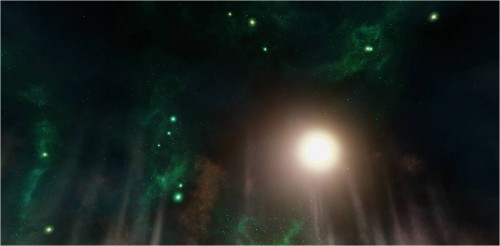
Nebula’s
The Nebula layers are simple cone meshes with X-tiling nebula textures. They also blend between red and green, just like the atmosphere shader. I set up about 4 of these layers, most of them scroll very slowly.
Textures are handpainted.
Skybox
The Skybox was generated using an application called Spacescape. It allowed me to generate a procedural, seamless space skybox.
Along with the skybox I set up lights for the sun, Lightbeams and lensflares.
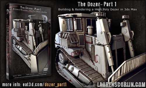
Eat3D DVD
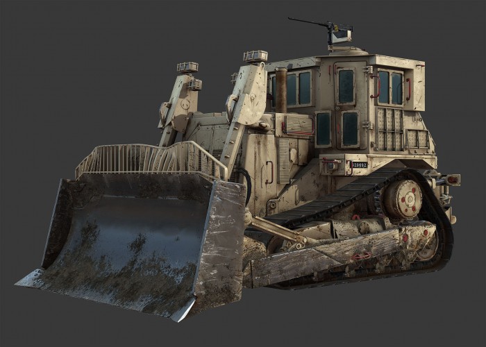
Finally! My Eat3D DVD has been released. A lot of hard work went into this, not just by myself but also Riki and his team at Eat3D. Thanks for this opportunity, Riki! Go check it out, perhaps buy it and support Riki’s great company, and give us some feedback!
I’m gonna put a detailed project page about this on my portfolio soon!
(also i’m still working on the spaceship from last post)
Hot Rod Series
Hot Rod Series
This page contains all the links to the making of series of my Brutal Rod hosted at cg.tutstplus.
Fireburst
FireBurst
Bridge
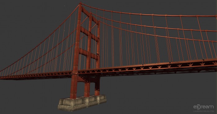
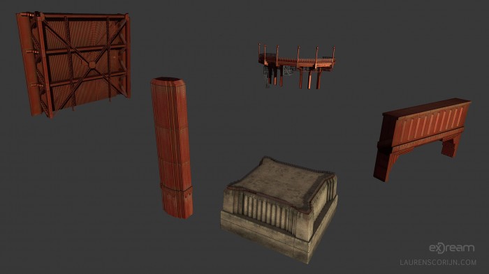
One of the biggest assets I made, is a modular set of pieces that form a bridge similar to the Golden Gate. I created about 7 modular pieces, totalling about 8000 tri’s of unique geometry and approximately 2048×2048 in combined texture sets. Special care was put into reusing texturespace and geometry, to keep the memory footprint down.
Ingame
Ship
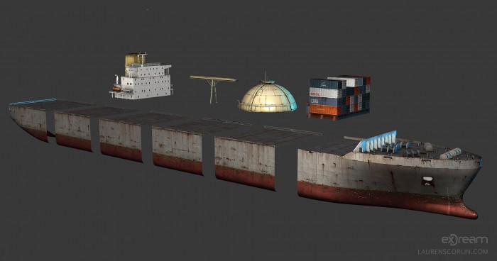
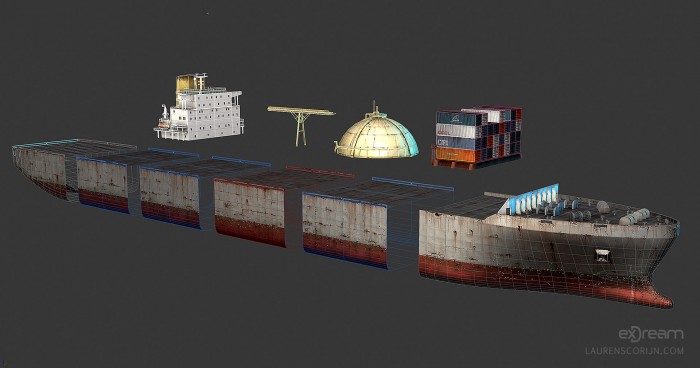
Another modular set of assets I created, are used as cargoship assets in the game. I focused on efficient creation, while still allowing dynamic variations between ships. A typical ship has about 20.000 tri’s and uses up to 6 1024×1024 texturesheets. All geometry and textures are shared between ship variations.
Textures
 The textures for the hull are interesting, because they allow for the geometry to be used in a very large number of combinations. The red lines show where textures are physically split (there are 3 1024’s for the hull). All textures tile with each other, and the center part tiles with itself and other parts, in every direction, even if you mirror or rotate the ship sections. That means there are almost 100 diferent tiling situations for the textures.
Ingame
Once ingame, I created Prefabs to represent several ship types. Using a shader I created with the material editor, I created several colorvariations for the ship hull (an RGB parameter determines the color). Decals were used for shipping company names on the side of the ships.
Car Nr 15
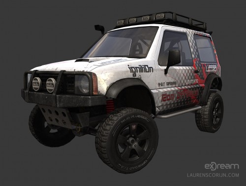
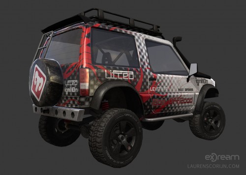
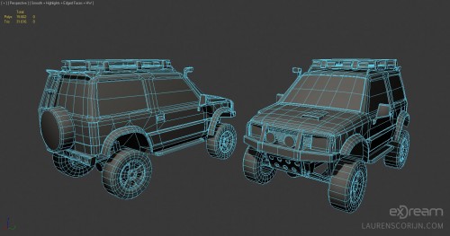
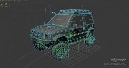
I completely remade one of the existing cars for the game, to better fit quality standards. This fictional car was designed and created from scratch by myself. It’s supposed to be a believable offroader that does not bear too much resemblance to existing car models.
The car was also rigged and skinned by me. I put great care in making sure the suspension was mechanically possible and believable, so that it would work and look interesting once rigged. Afterwards, I imported the car and set up the AnimTree, sockets and PhysicsAsset for the car.
PhoenixShader
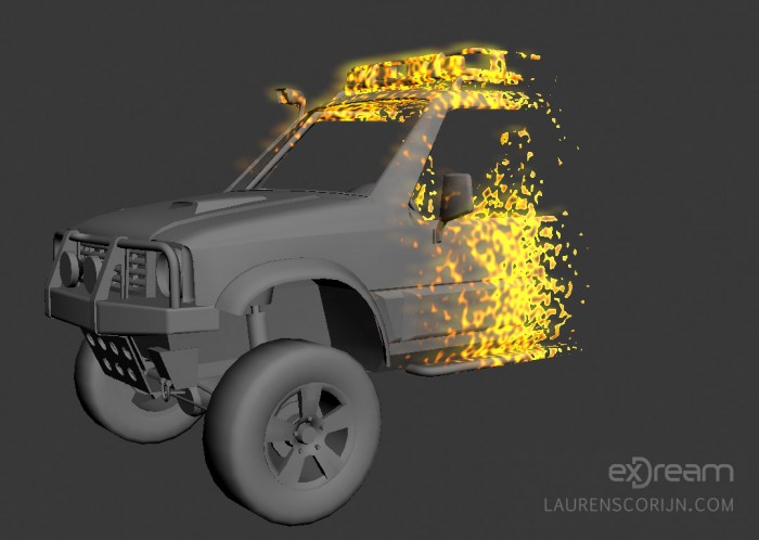
When a car respawns ingame, I was told it should look “like a phoenix, materializing from fire”. I set upon creating this effect with the Unreal 3 material editor.
I used an object-space blend on the X-axis of the object as a base. This blend is improved with a 3D noise effect (no texture seams), which was a custom node, created by the programmers at Exdream. This blendmask is then used for the opacity and emissive color of the object. Once my test case proved fully functional, the effect was integrated into the game.
Click the image to see the effect in motion. Ingame the effect would be combined with flame particles.
ContainerStacks
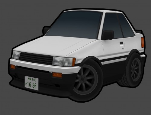
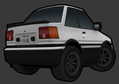
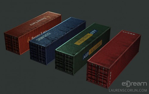
One of the most simple objects I created at Exdream, a container which is a simple 12 tri box, turned out to be one of the most interesting and versatile subjects.
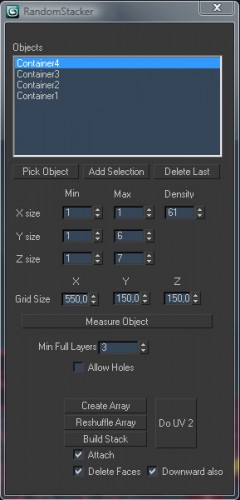
I faced the problem of having to create dozens of random, unique stacks, using up to 4 different containers. Manually randomizing things quickly turned out to be extremely tedious, so I turned to maxscript as a solution. I wrote a script which is essentially an extended Array tool with randomizing options, as well as automatic optimization of models.
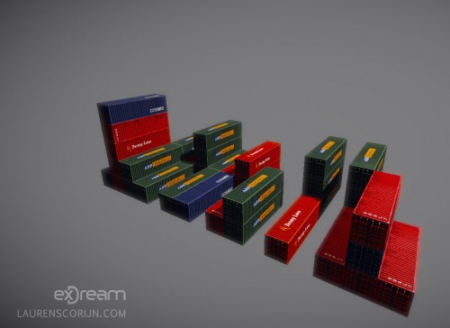
You add objects to the script, which measures the dimensions of one of the objects and uses this as grid size. You have control over density, the minimal number of full and whether floating containers, or holes are allowed. Once the randomized array is built, you can generate a model from it, or reshuffle things to get the same shape, but with different containers. The script will attach all generated containers, delete the faces on the inside and bottom, weld vertices and even create an automatic flattened UV on channel 2 for lightmap purposes.
In short, this script reduced 20-30 minutes of work per random stack to about 5 seconds.
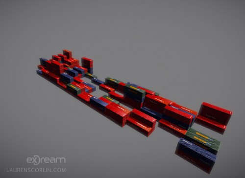
These are two examples of randomized stacks generated from the script. They turned out to be some of the most widely used assets in the entire game.

