The goal of this article is to adress some basic rendering and presentation issues that are commonly ignored by starting artists. They mostly apply to both software and realtime rendering.
Camera angle.
Everything starts with this. Choose a camera angle that frames your subject clearly and is at least somewhat aesthetically acceptable. Good pictures of a similar subjct can help you if you want to push this far.
First find a good angle in your viewport by freely navigating, then place the camera with Ctrl+C. After this you can add a tilt to the camera and do some final adjustments.
Rendersettings.
Apart from advanced settings like Global Illumination and light-tracing, there are a few settings you should never ignore. Always set your resolution high enough. 640 x 480 is the absolute minimum, 800 x 600 is preferable if you want things to be well visible. Consider using a different aspect, such as 16:9 instead of standard 4:3.
Secondly, this one can be really bothersome for the viewer: your antialiasing filter/sampler, when rendering with an software render engine. By default this one is set to the Area filter, which can look terribly blury and amateuristic. It is common for people with little insight to tweak the Area filter’s blur setting, making things even worse. Catmull-Rom is always a safe bet as an AA filter. If you use Vray, more filters will be available; Lanczos and Mitchell-Netravali are also quite good.
Lastly, when using Scanline renderer, it’s always best to use Global Supersamplers, since they make sure your textures are displayed crisper and clearer.
Render Environment.
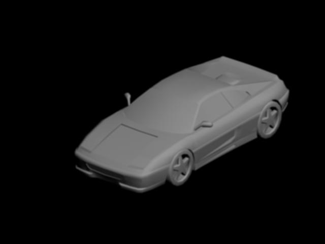
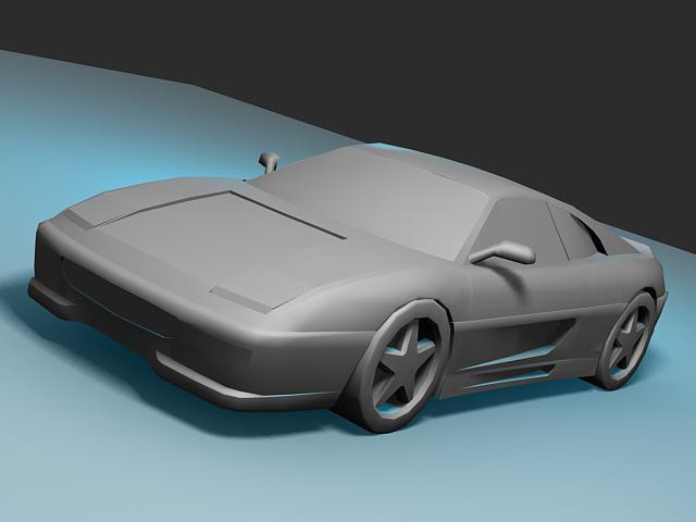
As a rule of thumb: NEVER use only pure black as background color, unless you know what your are doing and prefer this (98% of cases you won’t need it). Try dark grey, it always looks good. Placing some sort of simple plane with a good texture can really make your model seem more believable and isn’t much work to set up.
Materials.
Even when presenting a Work In Progress, you should pay attention to your materials. “Clay” material, gray with slight specular, is preferable when presenting your model’s shape. If you want to show a wireframe, use viewport grab in Edged Faces mode: maximise the viewport and use Tools>Grab Viewport. Gray is also preferable when presenting wires, and I personally like black as the wireframe color, white also works.
I won’t go further than these basic tips, materials deserve a guide by themselves, and are really dependant on your method (realtime/software).
Light.
When presenting a model, try to never use default lighting. Light is an entire topic by itself, but there are some safe solutions. When rendering offline, clay models look good with an indirect light such as a skylight, but you can also use the much faster E-Light. You can push this further and use a direct light to bring the shape forward even more.
Another method, which works well for realtime models, is to use a few (colored) omni lights. Use a Keylight from the front and one or more colored rimlight to define the shape by backlighting it.
Also try not to forget to use shadows. Especially when using a groundplane on which your model stands, you should use some form of shadows.
Saving Output.
This one can be overlooked easily: never forget to save your render decently. Never use anything else than JPG quality 100 in Max! It’s even better to save as TGA or BMP first and then resaving it as JPG in Photoshop (Photoshop’s Jpg compression algorithm is far superior to that of 3DS Max, if onyl for reducing the filesize vastly). Definitely save as TGA first when your image contains a lot of bordering red and black, JPG is notorious for having problems with this.
Example
The following is an example where on the first one, everything is wrong and on the second one, I’ve tried to apply all tips. I adjusted the bad version into the good version in under 5 minutes, to display how easy and non time-consuming it is to pay attention to this.


Leave a Reply
Want to join the discussion?Feel free to contribute!